Tuesday, December 11, 2012

Final Project

My business is a clothing company that specializes in homemade and custom clothing and accessories. The target audience is teenage and young adult females that like girly, unique, and fashionable clothing. The name is inspired by the forget-me-not flowers, as is displayed in my logo. 

My brochure contains information about the idea behind the business, what makes the business special, product samples and prices, shipping and contact information, and a special online offer. The whimsical font and bright bold colors help draw the attention of the target audience. The font also supports the home-made feel that the logo also displays. The images will let prospective customers see a sample of the clothing that has previously be offered so they can get a sense of the style of the company. It also effectively balances text with images so it is not too cluttered or void of info.

Photo credits belong to: Holly Bennett, Emily Johnston, Leigh Ann Hunt, Joshua O'neil photography, Caroline Julianna photography, and Nancy Faircloth photography. Thanks to Emily Johnston, Holly Bennett, Lauren Thompson, and Jessie Beckett for being my beautiful inspirations and models.


I wanted to keep my letterhead fairly basic, but also keep it special and not too blank. I chose not to use the logo at the top of the page, but rather make it more of a title, consistent with the one on the back of the brochure. But the company name seemed empty without the forget-me-not signature flowers beside it, so I made them the water mark on the page, light enough to type over and read, but visible just enough so that the reader won't be able to forget the Forget-Me-Not flair. I chose to have grass as the bottom border, consistent with the business card, to remind the reader of the home-made and natural aspect of the company. 


I chose to have a bottom border of grass on the business card to keep the natural and floral feeling of the company. The grass also inspired the use of stems, as a clever play on the logo itself. The back of the card also features the logo in a different format, so the viewer can't forget what company I work for! I also wanted to keep the back stylistically similar to the front, without exactly copying it, so I only had one stem up close. 

All together, each piece of the corporate identity has the same fonts, color scheme, and logo for a cohesive look and consistent information and style. 

Sunday, November 18, 2012

Corporate Identity


1)   What is your business?
Making homemade and custom clothing and accessories.

2)   Describe your business in one sentence
We create clothing and accessories with a unique, handcrafted, and down-to-earth style.

3)   Who is your target audience?
Teenage and young adult women

4)   Who are your competitors?
Love Me Threads + Accessories, Infinite Inspirations, CAbi 

5)   What makes them better/worse than your product/service?
Love Me Threads already has a working website and a broader audience base. Infinite Inspirations  has somewhat of a limited inventory. CAbi is more exclusive and expensive.

6)   Do you currently have an identity?  
      No
-----------------------------------------------------------------------------------------------------------------------------  

1)   How do you want your image to be seen in two years?
I want the company to be a go-to place for unique designs and trusted for quality, handmade products.

2)   If your company was an animal, what animal would it be and why?
A butterfly because are designs and natural, beautiful, delicate, and whimsical.

3)   If your company/brand was a person, who would it be and why?
Zooey Deschanel, because she is fresh, young, down-to-earth, and trendy.

4)   If your company/brand was an object, what would it be?
A flower.

5)   If your customer was a cartoon character, who would it be?
Alice from Alice in Wonderland because she is not afraid to be true to herself and she is full of creativity.

Tuesday, November 13, 2012

Lyrical collage


I chose the song "The Cave" by the band Mumford & Sons. The lyrics I used were:
"So come out of your cave walking on your hands
And see the world hanging upside down
You can understand dependence
When you know the maker's land"


I took the lyrics literally and put someone walking on their hands, coming out of a cave, and seeing the world hanging upside down. 

The images I used to composite this image are: 


Tuesday, November 6, 2012

Custom Graphic


I know that it just turned November, and I'm getting a little bit ahead of myself with this image, but I just love winter and living in Florida doesn't leave me much opportunity to see snow, so I made a snow globe! I used a tutorial to help create the snowman (http://10steps.sg/tutorials/photoshop/draw-your-snowman-in-photoshop/) and the rest of the image was created by using filters, gradients, and the paint brush. I created the snowflake brush and just adjusted the size to look like falling snow.

Tuesday, October 30, 2012

Self Insertion


This is me somewhere in Ireland.

Bonus photoshop fun: I removed a hand that was covering part of my waist. Can you tell?

Tuesday, October 23, 2012

Final Illustrator project


This image is based on the concept of nature. It features snow, trees, the night sky, and the northern lights. There is also a tent which is the only sign of civilization in an otherwise untouched, natural, environment.

Reference image:

Sunday, October 7, 2012

Final logo


The logo for the company incorporates an arrangement of the forget-me-not flowers, the flowers that the company is named after, which directs the target audience toward teens and young adults. The use of the bright and unique colors are meant to grab the attention of the viewer as well as invoke a youthful and joyful feeling. The font and graphic styles are both meant to convey a hand drawn aesthetic in order to reflect the hand-made and custom design focus of the clothing company. With the simplicity of the design, the logo can easily be used in a variety of formats and also be recognizable due to its unique shape and colors.


For reference images I consulted this picture of actual Forget-me-not flowers from http://flowerinfo.org/forget-me-not-flowers

and I also used my original sketch of the logo idea for the template of the final.


Tuesday, September 25, 2012

Logo idea sketches

For the logo design I chose to design for the Forget-Me-Not clothing company. I wanted to incorporate the forget-me-not flower in each of my designs, but still vary the layout, font, and use of the flower of each logo to get the best variety of ideas.


This first design is very simple, the name of the company inside the flower. If it were to be finalized I would add color and shading to make the logo more interesting. A benefit to its simplicity however would be that it would be easy to recognize from far away.


The basic concept behind this sketch is the middle object would be full of flowers being swept away in the breeze. The idea is that the flowers themselves would be calling out "forget-me-not" as they blow away.


This design is a little more bold or whimsical. It would be an attention-grabbing logo that expresses the youth and beauty of the clothing line. 


This logo demonstrates the emphasis of uniqueness and individuality of the clothing line. The tallest flower is not ashamed of itself and is proud of its beauty.


To add a bolder aspect to the logo, I decided to include a butterfly amongst the flowers. The text is also in all lower case letters for a different effect.


This logo puts much more emphasis on the name of the company, leaving the boarder of flowers as more of an after thought. This may be more effective on getting the name of my brand out there,


This logo features a small grouping of flowers extending from a long stalk, with the company name bending in the same manner as the stalk.

Sunday, September 23, 2012

Company ideas for logo design


Forget-me-not clothing company
A simple floral design, using the forget-me-not flower, that conveys a message of feminity and beauty.

Topsy-turvy cereal product
Upside down turtle shell to resemble a bowl full of the cereal. The cereal mascot will be a turtle to appeal to children.

Chillerz soda product
Cubic style letters that spell out the name of the product from within a glass with a straw sticking out of the top. Meant to resemble ice cubes in a glass.

Sparks Fly record label
Title of company in the middle of two concentric circles, the middle circle being a different color than the outer one, surrounded by sparks or fireworks.

Energize electronics company
The first letter of the company in cursive lettering with an electrical cord coming off the end, surrounded by sparks.

Logo critques


Disney

This logo displays iconic typeface that is unique to the Disney corporation, thus making that aspect in itself effective. The typeface is also effective because it conveys a whimsical feeling and appeals to both children and adults. The logo draws the viewer into the magical world that is Disney. I also like the way that the Magic Kingdom castle is incorporated to the design. The castle is very simplistic but recognizable, even if the Walt Disney title wasn't there, people would know the product was from the Disney company upon seeing the castle image. The use of a black and white color scheme makes the image defined and bold, which adds to the impact of the logo.


Starbucks

While for the most part, this logo is simple and easily recognizable, it is unclear as to the significance of the figure. I'm sure there is a thoughtful reason, however the origin is not common knowledge, making it unnecessary and possibly even confusing for the general public. For anyone who is not familiar with the Starbucks company, they would have no idea that they sold coffee products. In my personal opinion, it inhibits the designs effectiveness, but has been used so frequently that it is an accepted logo, regardless of meaning. I do like the simple two colored image and also the way that the white space on the edges are left undefined.

Chilis

What I think makes this logo most effective is that it doesn't rely on words to explain itself, people are able to figure out what company this logo is advertising for based off the graphic alone. The logo has a 3D effect on a 2D design by effectively using highlights and shadows, giving depth to the objects. It also uses two vibrant colors to draw in the attention of potential costumers. As an added bonus it uses red, a color generally associated with hunger, in order to advertise effectively its product of food. The logo is simple and streamlined, and there for versatile. It is also easily memorable because it uses an image in place of the name of the restaurant. 

Bp

The simplistic design makes this logo not only recognizable, but it uses bright colors so that its easy to pick out from far away. With this logo being for a gas station company, it can be used effectively to draw in potential customers, drivers in need to filling up their car. It relies on shape alone to attract costumers without cluttering itself with words. However, the shape does not convey any specific meaning that would tell customers what it is selling. The only meaning I can glean from it is its sun-like or bursting shape that can be interpreted to mean energy or power, which alludes to the power cars need to run and the gas they are selling that provides it.

NBC

Over the years this logo has become an iconic symbol for broadcasting TV station NBC. The design is simple: six of the same repeated shapes, seven if you include the shaped created in the negative space of the rest, and several bright colors. This version is a modern take on the traditional logo, using highlighting and metallic colors to convey a futuristic feeling. The shape itself is unique and easily recognizable. The logo is effective mostly because it has endured generations without changing much. I don’t really have any negative comments about the logo, but I'm curious as to the purpose behind it looking like a turkey.


Tuesday, September 18, 2012

Project 1: Island scene


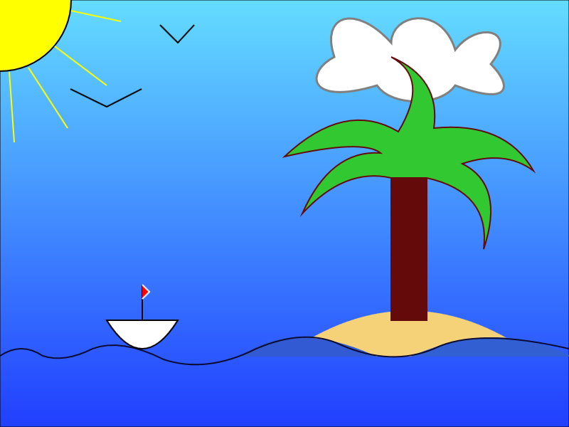
I began the picture with the simple shapes I already knew how to do, like the sun, rays, tree trunk, and island. Adjusting the color of the objects was the easiest part. The most difficult part of the project was creating the palm fronds and the waves of the water. A lot of the creation of the palm fronds was trial and error, plugging in different coordinates until it created the shape that I wanted. It took some time, but I am pleased with the final product. It is a successful image because it uses a variety of techniques of coloring, creating shapes, and it portrays the landscape scene that I pictured in my head.


Code:
<!DOCTYPE HTML>
<html>
<head>
<script>
window.onload = function() {
var canvas = document.getElementById("myCanvas");
var context = canvas.getContext("2d");

////////////////////////////////////// start below this line ??????????

//sky
context.beginPath();
context.rect(0, 0, 800, 600);
var grd = context.createLinearGradient(400, 0, 400, 800);
grd.addColorStop(0, 'rgb(100, 220, 255)');
grd.addColorStop(1, 'rgb(10, 10, 255)');
context.fillStyle = grd;
context.fill();
context.stroke();

//cloud
context.beginPath();
context.moveTo(470, 80);
context.bezierCurveTo(430, 100, 430, 150, 530, 120);
context.bezierCurveTo(550, 150, 620, 150, 640, 120);
context.bezierCurveTo(720, 150, 720, 120, 690, 90);
context.bezierCurveTo(730, 40, 670, 30, 640, 70);
context.bezierCurveTo(620, 5, 550, 20, 550, 60);
context.bezierCurveTo(500, 5, 450, 20, 470, 80);
context.fillStyle = 'white';
context.fill();
context.closePath();
context.lineWidth = 3;
context.strokeStyle = 'gray';
context.stroke();

//sun
context.beginPath();
context.arc(0, 0, 100, 4 * Math.PI, 1 * Math.PI, false);
context.fillStyle = 'yellow';
context.fill();
context.lineWidth = 2;
context.strokeStyle = 'black';
context.stroke();

//sun ray 1
context.beginPath();
context.moveTo(100,15);
context.lineTo(170,30);
context.strokeStyle = 'yellow';
context.stroke();

//sun ray 2
context.beginPath();
context.moveTo(77,65);
context.lineTo(150,120);
context.stroke();

//sun ray 3
context.beginPath();
context.moveTo(40,95);
context.lineTo(95,180);
context.stroke();

//sun ray4
context.beginPath();
context.moveTo(13,101);
context.lineTo(20,200);
context.stroke();

//island
context.beginPath();
context.moveTo(400, 500);
context.quadraticCurveTo(575, 375, 750, 500);
context.closePath();
context.fillStyle = 'rgb(245, 210, 120)';
context.fill();
context.strokeStyle = 'rgb(245, 210, 120)';
context.stroke();


//water
context.beginPath();
context.moveTo(582, 500)
context.quadraticCurveTo(700, 450, 800, 500)
context.closePath();
context.fillStyle = 'rgb(50, 95, 210)';
context.fill();
context.strokeStyle = 'rgb(50, 95, 210)';
context.stroke();

context.beginPath();
context.moveTo(340, 500);
context.quadraticCurveTo(413, 450, 525, 500)
context.closePath();
context.fillStyle = 'rgb(50, 90, 210)';
context.fill();
context.strokeStyle = 'rgb(50, 90, 210)';
context.stroke();


context.beginPath();
context.moveTo(0, 500);
context.quadraticCurveTo(30, 480, 60, 500)
context.quadraticCurveTo(90, 510, 130, 490)
context.quadraticCurveTo(170, 475, 230, 505)
context.quadraticCurveTo(290, 525, 360, 490)
context.quadraticCurveTo(430, 460, 480, 485)
context.quadraticCurveTo(550, 515, 610, 490)
context.quadraticCurveTo(670, 460, 800, 490)
context.strokeStyle = 'rgb(10, 10, 50)';
context.stroke();

//tree
context.beginPath();
context.rect(550, 250, 50, 200);
context.fillStyle = 'rgb(100, 10, 10)'
context.fill();
context.strokeStyle = 'rgb(100, 10, 10)'
context.stroke();

//palms
context.beginPath();
context.moveTo(600, 250);
context.quadraticCurveTo(690, 270, 680, 350);
context.quadraticCurveTo(710, 260, 650, 230);
context.quadraticCurveTo(710, 210, 750, 240);
context.quadraticCurveTo(710, 170, 610, 180);
context.quadraticCurveTo(620, 110, 550, 80);
context.quadraticCurveTo(605, 110, 560, 185);
context.quadraticCurveTo(485, 140, 400, 220);
context.quadraticCurveTo(510, 195, 535, 215);
context.quadraticCurveTo(465, 210, 425, 300);
context.quadraticCurveTo(485, 235, 550, 250);
context.closePath();
context.fillStyle = 'rgb(50, 200, 50)'
context.fill();
context.stroke();

//birds
context.beginPath();
context.moveTo(99, 125);
context.lineTo(150, 150);
context.lineTo(199, 125);
context.lineJoin = "miter";
context.strokeStyle = 'black'
context.stroke();

context.beginPath();
context.moveTo(225, 35);
context.lineTo(250, 60);
context.lineTo(273, 35);
context.lineJoin = "miter";
context.strokeStyle = 'black'
context.stroke();


//boat
context.beginPath();
context.moveTo(150, 450);
context.quadraticCurveTo(200, 530, 250, 450);
context.closePath();
context.fillStyle = 'white';
context.fill();
context.stroke();

//mast
context.beginPath();
context.moveTo(200, 450);
context.lineTo(200, 400);
context.stroke();

//flag
context.beginPath();
context.moveTo(200, 400);
context.lineTo(210, 410);
context.lineTo(200, 420);
context.lineJoin = "miter";
context.fillStyle = 'red';
context.fill();
context.strokeStyle = 'white';
context.stroke();


////////////////////////////////////// end above this line ˆˆˆˆˆˆˆˆˆˆˆˆˆˆˆ

};

</script>
</head>
<body>
<canvas id="myCanvas" width="800" height="600"></canvas>
</body>
</html>

Tuesday, September 11, 2012

Heart

Code:


<!DOCTYPE HTML>
<html>
<head>
<script>
window.onload = function() {
var canvas = document.getElementById("myCanvas");
var context = canvas.getContext("2d");

////////////////////////////////////// start below this line ??????????

context.beginPath();
context.rect(0, 0, 800, 600);
context.stroke();

context.fillStyle = 'rgb(255, 100, 100)';
context.fill();

context.beginPath();
context.moveTo(400, 200);
context.bezierCurveTo(550, 50, 550, 300, 400, 450);
context.lineWidth = 10;
context.strokeStyle = "black";
context.stroke();

context.beginPath();
context.moveTo(406, 200);
context.bezierCurveTo(250, 50, 250, 300, 406, 450);
context.lineWidth = 10;
context.strokeStyle = "black";
context.stroke();


////////////////////////////////////// end above this line ˆˆˆˆˆˆˆˆˆˆˆˆˆˆˆ

};

</script>
</head>
<body>
<canvas id="myCanvas" width="800" height="600"></canvas>
</body>
</html>

Tuesday, August 28, 2012

My Name is Leigh Ann Hunt. I'm from Melbourne, Florida, which is about 2 hours from Tampa. I am a New Media Production major and hope to work on special effects in movies in the future. I am an Adobe Certified Associate in PhotoShop, and also have worked on several projects using Illustrator, InDesign, Premiere Pro, and Flash. I hope this class will allow me to expand my skills in the digital arts field and and develop real world experience.