Tuesday, December 11, 2012

Final Project

My business is a clothing company that specializes in homemade and custom clothing and accessories. The target audience is teenage and young adult females that like girly, unique, and fashionable clothing. The name is inspired by the forget-me-not flowers, as is displayed in my logo. 

My brochure contains information about the idea behind the business, what makes the business special, product samples and prices, shipping and contact information, and a special online offer. The whimsical font and bright bold colors help draw the attention of the target audience. The font also supports the home-made feel that the logo also displays. The images will let prospective customers see a sample of the clothing that has previously be offered so they can get a sense of the style of the company. It also effectively balances text with images so it is not too cluttered or void of info.

Photo credits belong to: Holly Bennett, Emily Johnston, Leigh Ann Hunt, Joshua O'neil photography, Caroline Julianna photography, and Nancy Faircloth photography. Thanks to Emily Johnston, Holly Bennett, Lauren Thompson, and Jessie Beckett for being my beautiful inspirations and models.


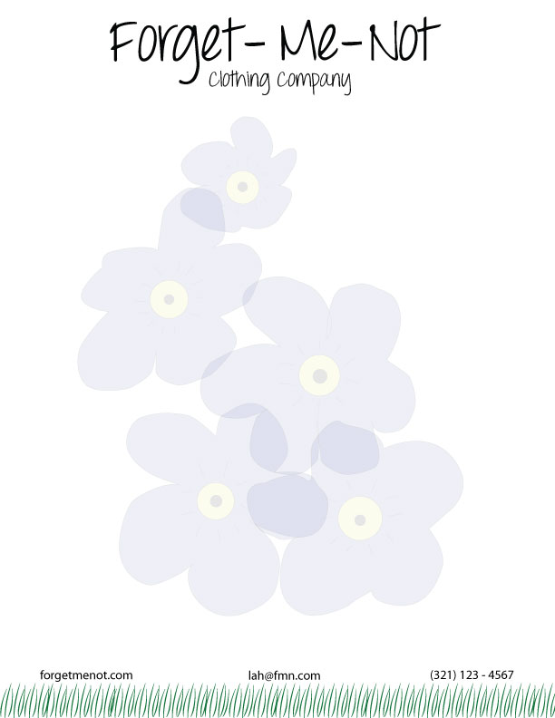
I wanted to keep my letterhead fairly basic, but also keep it special and not too blank. I chose not to use the logo at the top of the page, but rather make it more of a title, consistent with the one on the back of the brochure. But the company name seemed empty without the forget-me-not signature flowers beside it, so I made them the water mark on the page, light enough to type over and read, but visible just enough so that the reader won't be able to forget the Forget-Me-Not flair. I chose to have grass as the bottom border, consistent with the business card, to remind the reader of the home-made and natural aspect of the company. 


I chose to have a bottom border of grass on the business card to keep the natural and floral feeling of the company. The grass also inspired the use of stems, as a clever play on the logo itself. The back of the card also features the logo in a different format, so the viewer can't forget what company I work for! I also wanted to keep the back stylistically similar to the front, without exactly copying it, so I only had one stem up close. 

All together, each piece of the corporate identity has the same fonts, color scheme, and logo for a cohesive look and consistent information and style. 

Sunday, November 18, 2012

Corporate Identity


1)   What is your business?
Making homemade and custom clothing and accessories.

2)   Describe your business in one sentence
We create clothing and accessories with a unique, handcrafted, and down-to-earth style.

3)   Who is your target audience?
Teenage and young adult women

4)   Who are your competitors?
Love Me Threads + Accessories, Infinite Inspirations, CAbi 

5)   What makes them better/worse than your product/service?
Love Me Threads already has a working website and a broader audience base. Infinite Inspirations  has somewhat of a limited inventory. CAbi is more exclusive and expensive.

6)   Do you currently have an identity?  
      No
-----------------------------------------------------------------------------------------------------------------------------  

1)   How do you want your image to be seen in two years?
I want the company to be a go-to place for unique designs and trusted for quality, handmade products.

2)   If your company was an animal, what animal would it be and why?
A butterfly because are designs and natural, beautiful, delicate, and whimsical.

3)   If your company/brand was a person, who would it be and why?
Zooey Deschanel, because she is fresh, young, down-to-earth, and trendy.

4)   If your company/brand was an object, what would it be?
A flower.

5)   If your customer was a cartoon character, who would it be?
Alice from Alice in Wonderland because she is not afraid to be true to herself and she is full of creativity.